
Instagram Saves

Timeline
Oct - Dec 2024
Discipline
UX/ UI / Self-Project
My Contribution
Visual System
Branding
UX Design
Interface Design
Interaction Design
Contributors
Designer Darcy McSwain
Designer Maggie Chu
Designer Ellie Huang


Instagram's Saved Feature included three main actions: Viewing your saves on your profile, saving posts from the Explore page, and saving posts on the Reels page
Feature 01
Saved posts on Profile
To view saved items, users must open the hamburger menu, select "Saves," and then choose a collection.

Feature 02
Saved posts on Explore
Users can tap the save button once to automatically add the post to the "All Posts" collection, or double-tap to select a specific collection from a horizontal scroll menu.
Feature 03
Saved posts on Reels
Users can click the three dots to open a slide-up menu and select "Save," but there’s no option to add the Reel post to a specific collection.
I tasked a diverse group of user testers, of different ages, genders, and ethnicities, with specific tasks related to the Save Feature. I also developed a set of post-task questions to help better align myself with user tasks, goals, and pain points
User Interviews
Reported that they save a lot, but hardly ever revisit their Saved Posts
A portion of users didn't how to save to a Collection
Users unanimously didn't like the location of Saved Posts currently as it wasn't easily/readily accessible

Competative analysis
I analyzed how successful apps have managed to deploy saving features and how they've optimized this experience with UX and layout

Guiding goals for my projects redesign based off research and interviews
Consistency and familiarity — Keep the Saved Posts user flow consistent across all pages and in line with Instagram's brand.
Discoverability and simplicity — Ensure users have quick and accessible access to buttons and menus. Limit clicks as much as possible.
The details, changes, and improvements I made to improve Saves on Profile, Saving Posts, and Saving Reels.
While Instagram wanted users to save posts to their profiles more often, their interface struggled to meet expectations.
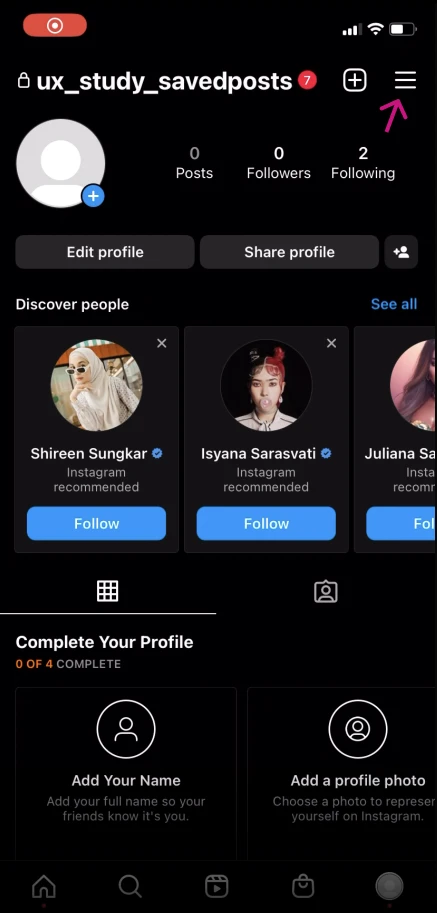


As users attempted to navigate to their Saves, the hidden button in the hamburger menu hindered their user experience
Hamburger menu makes Saves hard to find
Too many clicks can discourage users from revisting Saves
To address the previously mentioned issues, I aimed to reduce the number of user actions required to encourage more revisits. One key problem was the low discoverability of the Saves feature on the Profile page. To improve this, I moved the Saves button out of the hamburger menu, making it more easily accessible, and experimented with various locations to find the most intuitive placement.

Solution
The new Saves button is located next to the gallery, Reels, and Tagged photos button for quick and familiar access.
Driving Discoverability — By changing the Saved Buttons location to a more accessbible location, the updated navigation is optimized for users to revisit their previous Saves.
Improved Layout — Changing the Collections layout from 2 grid layout to 3 grid layout allows for more content presentation and allows users to view more of their Saves with reduced scrolling
When saving a post takes 2-3 more clicks than liking, one can't blame users for feeling discouraged from going through the hassle of saving a post to a collection.


Unlike their competitors, saving an Instagram post is no quick and easy feat. Making users double-click the Saves button is unintuitive and leads to posts being saved without a designated collection.
This issue is further compounded by horizontal scrolling, which conflicts with Instagram’s typical vertical scrolling format.
Furthermore, the confirmation banner disappears too quickly, leaving users uncertain about whether their post was successfully saved.
Extra clicks to perform actions is unintuitive
UX is not consistent with the rest of the app; Horizontal scrolling reduces visbility and hinders user experience
Lack of confirmation notifcations can make users feel unsure
Based off competitive analysis, I replaced the horizontal scroll bar to a vertical one. This allowed users to quickly scan their collections and save faster

The final design gets rid of the double-click save option, prompting users to save directly to a collection. The notification banner also lingers for longer, ensuring users feel confident in their actions. This streamlines the flow but also provides a more personalized and user-centered saving experience, ultimately enhancing user satifucation and engagement with exploring new posts.
Much like saving a post, saving Reels is just as unintuitive and inconsistent, leading to both Reels and Saves diminishing in value.


If Instagram wants to compete with other short-form content platforms, the ability to easily save Reels needed to be scaled up. Currently, the interface is confusing, hard to navigate, and inconsistent.
Saved button is hidden in nested dots
Saving is different from the rest from the app as it doesn't give users can option to add to a collection, which may discourage users saving Reels
Altering the bookmark feature to Reels was a fairly straightforward process. To maintain consistency, I decided to use the same navigation that appears on the Explore page.

Saving Posts Flow on Explore

New Saving Posts Flow on Reels
A Save button is available on the right side of the screen along with the other previous buttons. Clicking the Save button opens the same vertical menu with Save options. The confirmation notification was also changed to match how it appears on Explore for consistency.
Promotes Engagement — With the added ability to add Reels to certain collections, it invites users to explore and interact with Reels with new possibilities in mind